UCS - Start the game from the menu
Our first Use Case Specification is about starting the game from the menu page. It can be found here: UCS - Start the game from the menu
UCS - Start waves
Our second Use Case Specification is about starting the waves from within the game. It can be found here: UCS - Start waves
Development Progress
Since our last publication of our development-progress, we worked on some game-logical features.
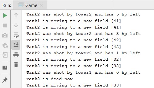
At the moment, our game engine is able to start a game, load enemies and towers and simulate the typical procedure of a game. On the screenshot, one can see our game running with given towers and enemies as well as the defined map of week 2.
Within the next weeks, our team will focus on the UI so that objects can be representated visually.


Hello Towerdefense Team,
apart from some Spelling mistakes i can’t find much to criticize you on.
The handdrawn Mockup for the Start Game UseCase should be improved.
Try to avoid declaring Topic X.1 if there is no X.2.
It is nice that you made Progress in Development, yet the Screenshot of the console output is missing almost any context required to understand it.
The Contents of the Specifications are don well, the Flows are coherent and are easy to understand.
Kind regards,
Tobias
Your activity Diagram does not confrom with UML standards
Hi Tobias,
Yes, our hand-drawn mockup is not very fancy, we will update the picture as we modelled it in Android Studio in the next weeks. As we had some progress in the backend of our gameengine we will focus now on the user interface. Maybe we can add more information about the game engine next time so that it is clear to everyone what’s going on there. We will correct the UML diagram and the topics. Thanks for your constructive feedback!
Hey Tower-Defenders,
looks like you’re on to something big, keep up that vision. We really liked your menu mockup, but maybe you should’ve used Google Mockups or something similar.
Your activity diagrams and narratives diverge a little. For example, your AD shows that the „Next wave“ button is clickable after all enemies have spawned, but the narrative shows that the next wave is only beginning after none of the enemies from the previous wave are left. Maybe you can adapt that to the button only being clickable when it’s actually doing something.
Also we’re wondering how the different difficulties are varying.
Stay classy,
Ted’s Team
Hi Ted’s Team,
thanks a lot for your constructive feedback and your suggestions to improve.
We completely agree that our menu-mockup was not fancy yet. Recently, we re-created the mockup so that it looks more fancy now.
Concerning the activity diagram(s), we are still working on it.
Thanks again for your proposals!
Kind regards,
Nicolas
Hi there, I am sorry having to say That I can not locate your linked use-cases. You should probably fix the links there. Once they are back online, I will have a look at them. Other than that your development progress seems impressive, considering that you guys are creating a game and an in-house engine.
Regards,
Sam from Cozy
Hi Samuel,
I am sorry for the inconvenience concerning the links. Due to a revision of our documents on github, the links have been outdated, but now, they are now up to date again. Thanks for that hint!
Within the next weeks, we will try to progress more far so that some more interesting information about the game (-development) can be published. Thanks for your interest!
Kind regards,
Nicolas